

2-for-1 Bode Sample Sale
2-for-1 Bode Sample Sale
A REVIEW OF 'LANDS END', AN EXHIBITION NOT ABOUT BODE(?)

Walking to MAMA, a Whitechapel gallery, through a concrete corridor intermittently spot-lit, felt like accepting death in an arena. Traipsing through the door to their most recent exhibition, LANDS END featuring the work of Eva Dixon and Benedikte Klüver, felt like interrupting the last eight minutes of a Bode sample sale.
For those not in the know, Bode is a luxury fashion retailer pronounced Bodé, as in a-bode and then é as in café. I, for the longest time, was calling it Bode as in fore-bod-ing. Foreboding as in eerie, as in entering a white cube to be met with flattened-out emaciated trucker jackets, tarps and tents nailed between wood stretchers; fabric stuck with patch appliqués and little fussy stitches, all referencing Americana-looking industries of yore. (I’m not writing of yore enough.)
I have taken the liberty to match Bode garments to artworks because I think art criticism isn’t enough like a Twitter thread comparing Ethel Cain outfits to Sylvanian Families.

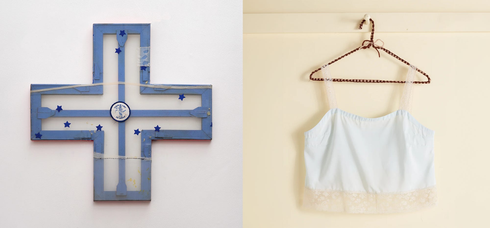
There’s a Lana Del Ray cross-shaped painting (Charlie Lima, Eva Dixon) drum-skinned with sheer glitzy fabric adorned with royal blue stars—it can all read shot-gun wedding at the drive-in, Las Vegas via Los Angeles, on a lifeboat(?).
Dixon isn’t American but that’s never stopped anyone before.
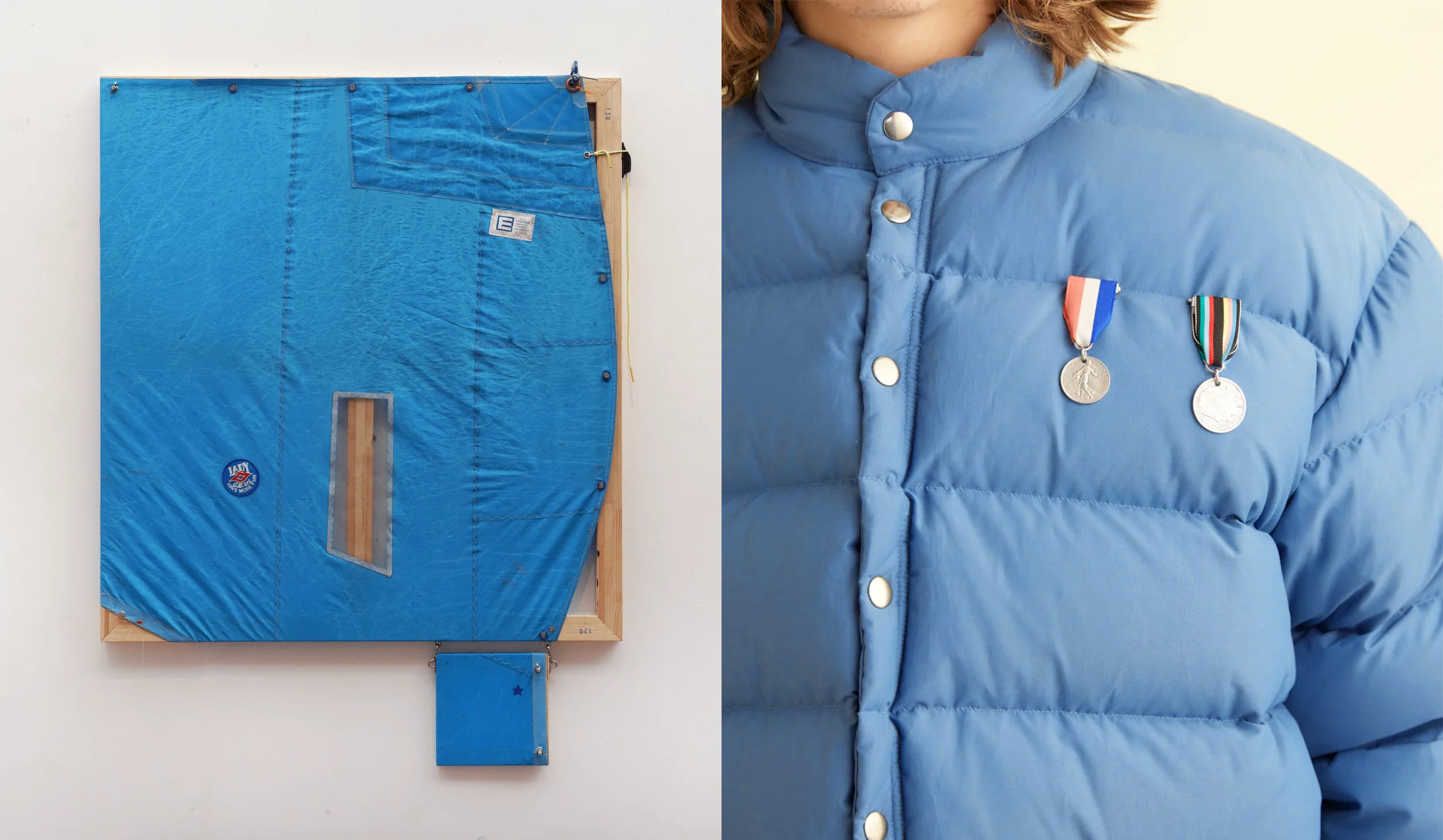
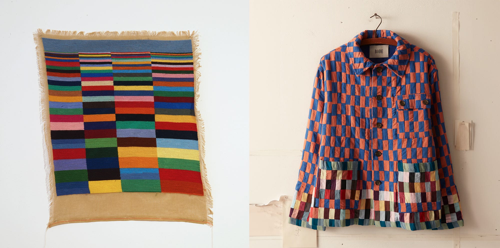
My sincerest apologies, before I continue, but there’s a Wes Anderson energy here. Which isn’t a bad thing! Not quite a great thing either. There’s nylon strapping (I’m 50, Eva Dixon), needlepoint (Expanse, Benedikte Klüver), and that specific yellow-orange tent colour. The one that when you search ‘yellow-orange tent film’, screencaps of The Royal Tenenbaums (2001) come up on Pinterest. It’s all a bit indie 2010s, Arcade Fire’s ‘The Suburbs’ on vinyl, beard oil, wanderlust art.

In the interest of being fair, here’s a bit of what the exhibition PR had to say:
By inheriting ancient or ancestral practises and materials whilst also subverting tradition and expectation, both artists enter into a kind of invention zone. Klüver is imagining a future, mapped out in colour. Dixon is imagining a past that never existed. She carves out work that isn't nostalgic, nor explicitly autobiographical, but omnipresent and urgent. Whilst innately imbued with her own personal history of making, her pieces are representative of a time that never happened, like heirlooms from a fictional universe.
Author’s note: I don’t know about that last bit. I definitely think the badge pinned onto a bit of stretched fabric came from our universe. Whatever. Also, petition to remove ‘urgent’ from our PR-writing vocabularies—are we all just calling work desperate?
Author’s note on the author’s note: this is not a slight against the artists, I am in fact beefing with Eve Delaney—writer of the PR.
Anyway, here’s what Bode, the luxury fashion brand, has on its website:
Bode is an American luxury brand that expresses a sentimentality for the past through the study of personal narratives and historical techniques. Modern workwear silhouettes united with female-centric traditions of quilting, mending, and appliqué shape the collections. Each piece tells a story and is tailor-made.
I’m not here starting a lawsuit but that spade’s a spade, your honour. Bode’s whole bit is that the fabrics are reclaimed, or inspired by those from an imagined or actual history. Offering consumers a bit of something to read, to feel good about, before purchasing a garment. Though to the layman, it’s a blouse.
Before going any further on my Bode tirade, I think the materials in LANDS END are terrific and fun. I haven’t had as good a time with paintings pretending to be sculptures in quite a while. I often think, just make a sculpture. Yet, here I am, here for it. Who cares if it looks like Moonrise Kingdom (2012). I love the kind of tumourous appendage dangling off Dixon’s Lady CB'ers have more fun (2024) and the draped-folded-skin-circus-tent in Klüver’s Theatre (2024).
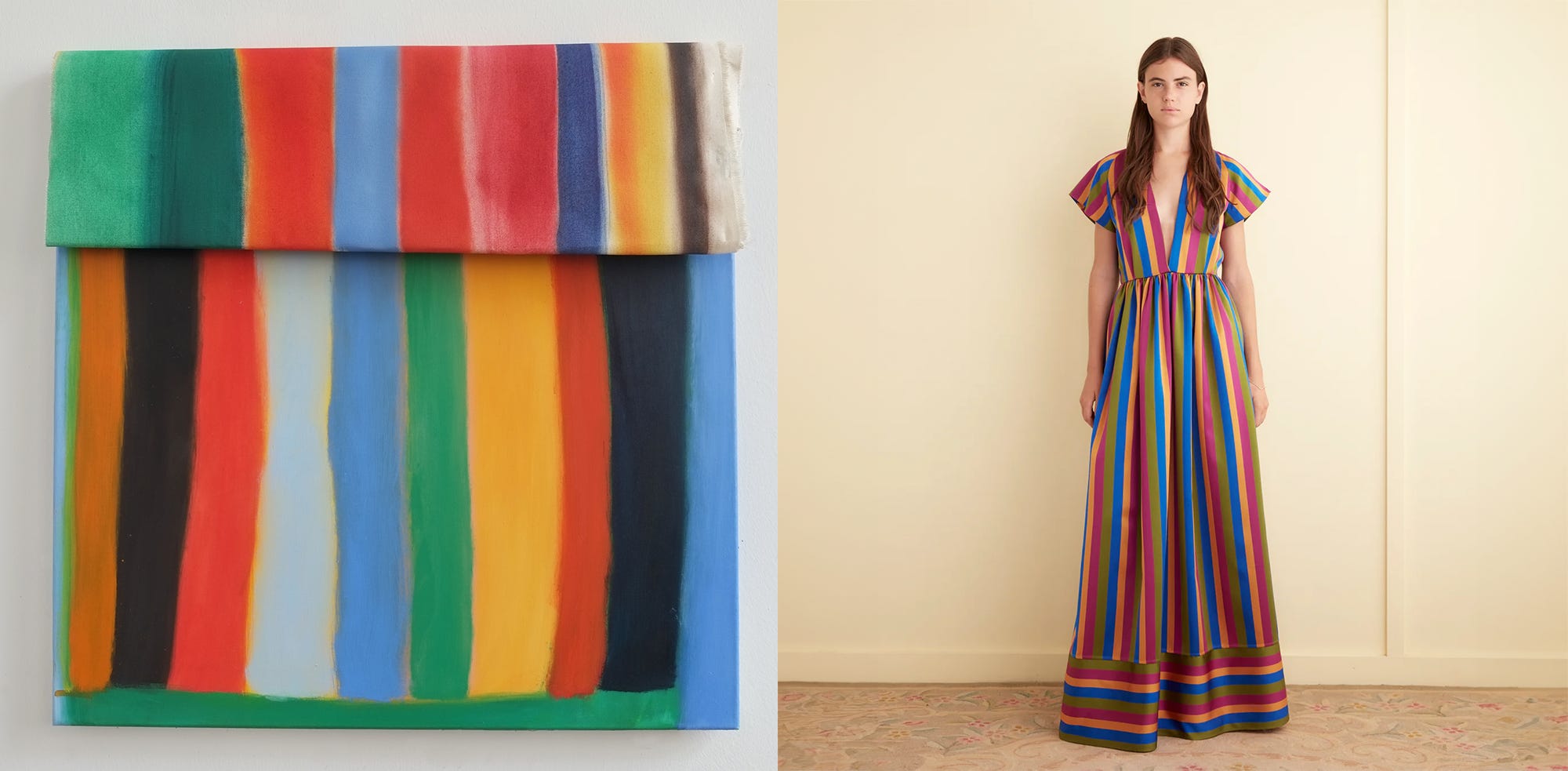
I did think, if we are going to be critical, that Klüver’s paintings’ reliance on colour to transcribe personal history and meaning to be quasi-tenuous. I don’t think that reads, what I got was ‘That’s a big abstract painting.’ It feels like curatorial shoehorning. I think Klüver’s form/material is doing heaps more for evocation. Perhaps these artists have near-identical practices with varying outcomes, perhaps that’s just what the PR says. It’s all see-something-say-something criticism regardless, free word association, Rorschach engagement.

Yet, something is striking about these warm artworks, saturated with clue-like pieces of meaning scattered across a cold white cube gallery. Crouching to look in on a patch or button badge, needlepoint, picturing myself anywhere but here. It reminds me (I’m sorry) of this photo of the Spring 2024 Bode pop-up store at Nordstrom’s New York City flagship on Broadway. Clean, stark, huge and weird with little kitschy patchwork pieces inside. Meaning more saturated. More than a blouse.
—Andy x